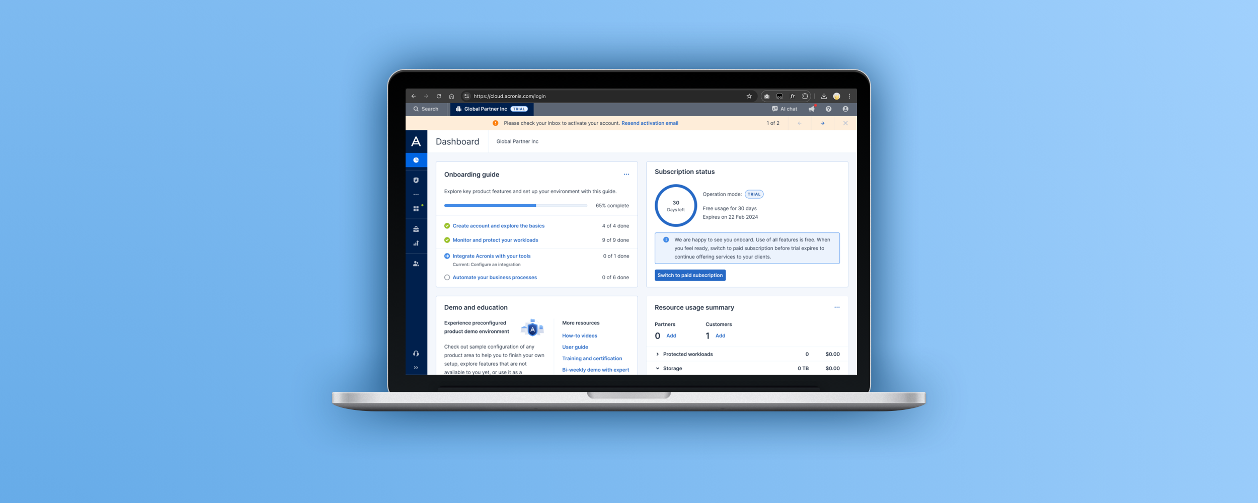
Acronis Trial Sign-up
Background
Acronis provides backup & security solutions to consumers, businesses, and MSPs (Managed Service Providers). We offer a 30-day free trial for all our products.
Understanding the problem
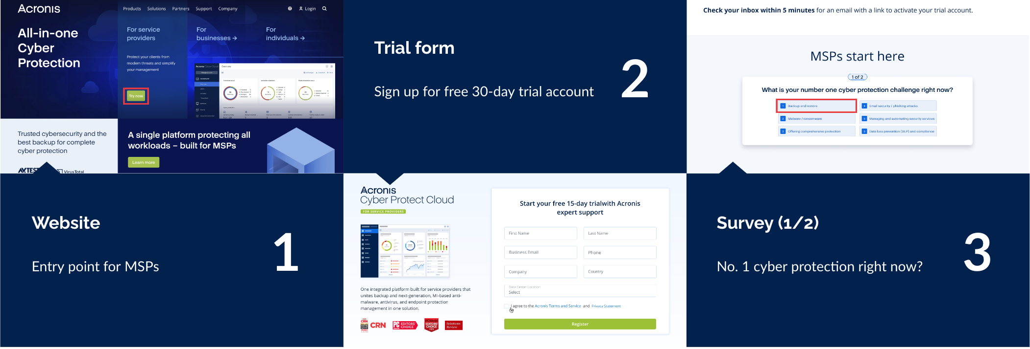
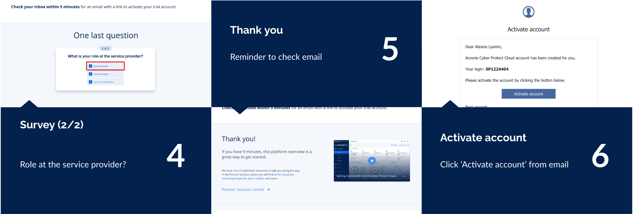
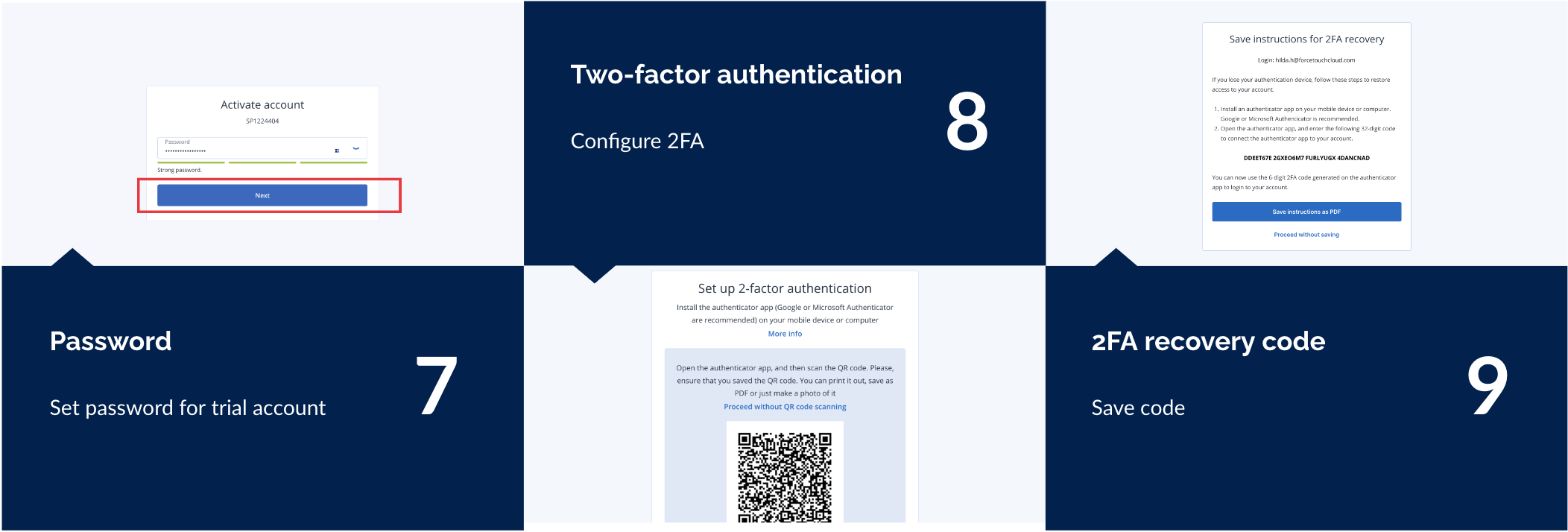
Current trial registration flow for MSPs (Managed Service Providers) has 12 steps. Based on data analytics (Google Analytics, click rates), it was revealed that there is more than 50% drop off at each step.
Product goal
From these findings, we decided as a product to identify key business goals:
- Reduce the friction during sign-up so that the user
- Make the sign up process more engaging and worthwhile
- Guide the user to set up the product easily without the need for a sales partner
Competitor's Research
As a starting point, I did some market research on 10 products with easy and engaging sign up flows. I found these interesting findings:
1. Email verification alternative
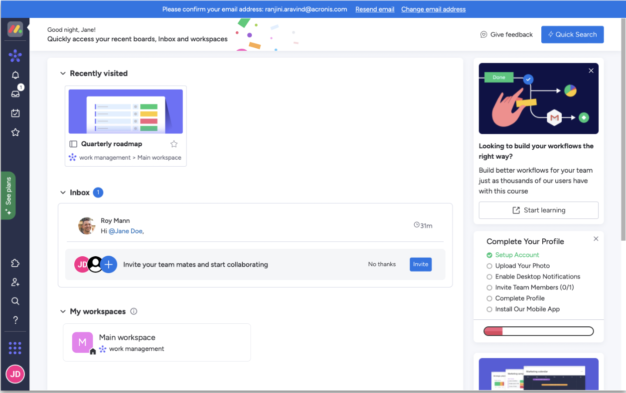
In Monday.com, instead of forcing a user to verify email during the sign-up process, they used a blue banner on their product dashboard to nudge the user to complete email verification instead.
This solution would help us reduce the number of steps in our sign up process and also avoid the potential context switch caused when the user has to verify their email from another browser window or device.
2. Ease of completion
After reviewing products like Evernote, Asana, and Calendly, I noted that their sign-up and onboarding wasn't necessarily short. Oftentimes, they had over 10 steps. But since each step was quick, easy, and engaging, the process felt smooth and worthwhile.
This observation helped us pivot from focusing on just reducing the number of steps to actually considering the ease of completion instead. E.g. Does this step require the user to look for information elsewhere?
3. Visible process
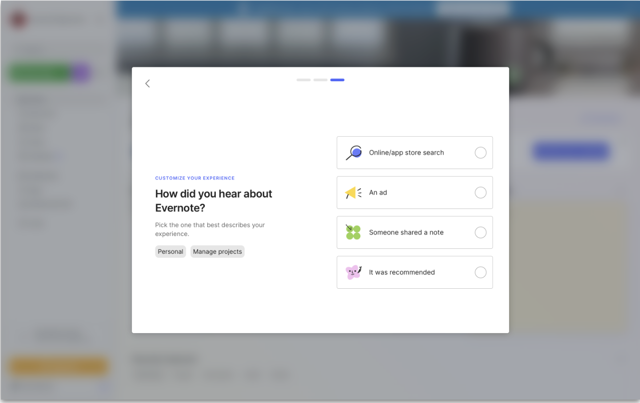
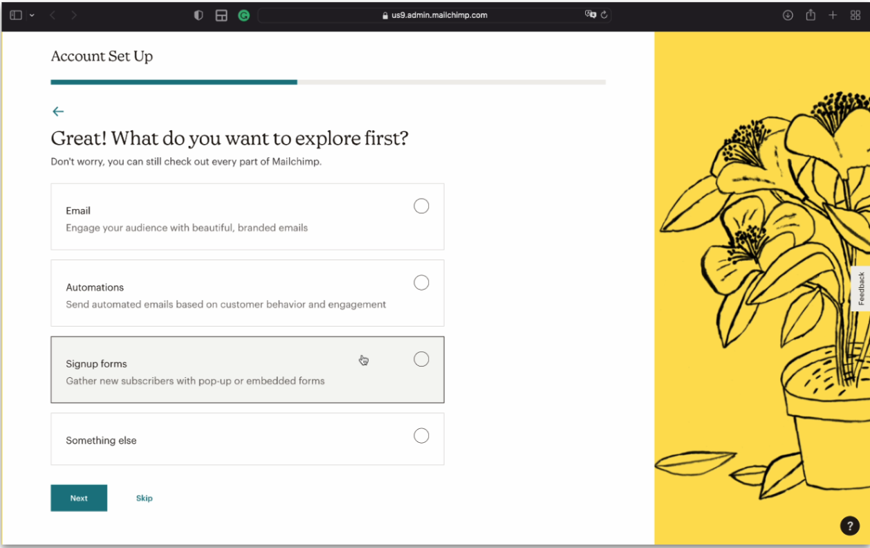
In all the products I reviewed, there was always a visual element representing the progress like progress bars, success messages, task completion etc
This helped us realize that users were probably dropping off in our current flow due to a lack of transpency on how long the process can be. They might be less likely to drop off if we made the progress visible.
4. Personalization
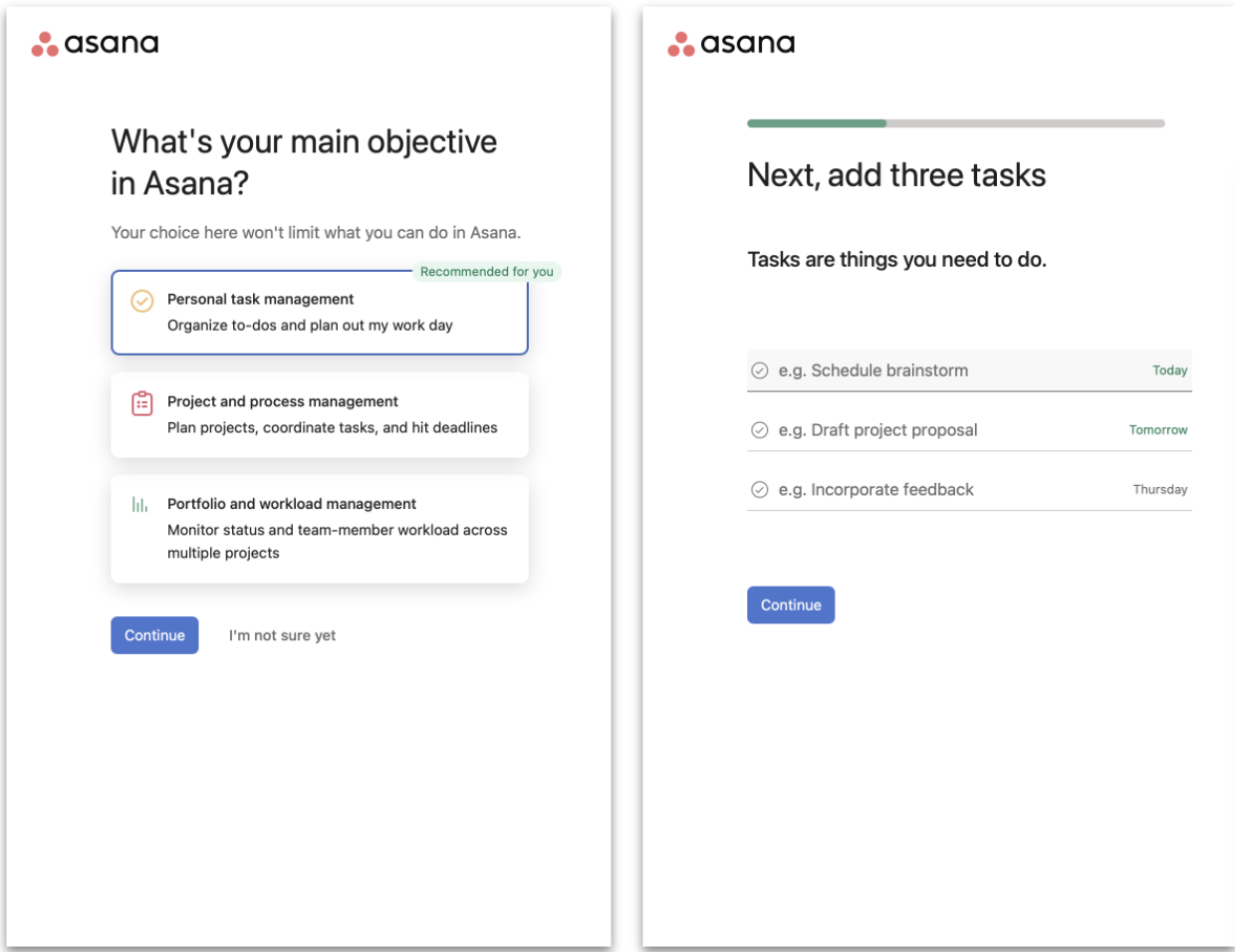
One of the key features that made the sign-up process feel worthwhile in the products I reviewed was that they helped me customize the product to my specific needs. For example, in Asana, I was asked to enter a list of tasks so that when I landed on their dashboard for the first time, it was already filled with my data.
This gave us an idea to use survey questions within the sign-up process as a tool to personalize the product and help the user achieve their specific goals faster.
Challenges in the process
As in any corporate setting, I faced a few obstacles while championing for a radically different process.
- Negotiating with the legal team to consolidate the legal terms and supplementary terms (Steps 11 and 12 in the current process) into the trial registration form itself was tricky. I had to seek help from the Product managers to help during these discussions.
- Negotiating with the sales team to consolidate and move the survey (Steps 3, 4, and 10 in the current process) to post-signup (inside the product) was also tough because it was important information for them to gather and they were concerned about users skipping it.
- Lots of opinions from lots of stakeholders!!! I had multiple review calls with design team, leadership and product managers to iterate through this process gradually and reach consensus.
Improvements
The main improvements were:
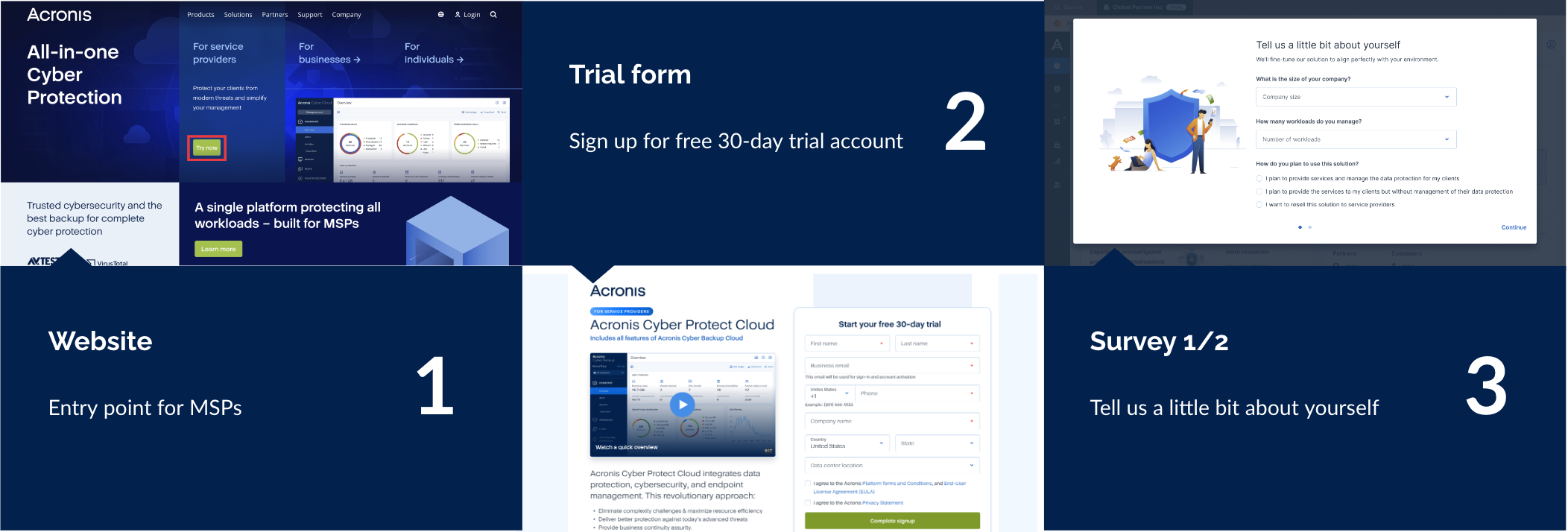
- Consolidate legal and supplementary terms as checkboxes into the newly designed registration form.
- Show survey as a modal window on the dashboard with a progress bar. It gives an impression to the user that they almost landed on the dashboard and are almost done.
- Use survey answers to customize the onboarding for the user. For example, if they are interested in backup, onboarding is customized to highlight backup features
- Use a banner in the dashboard to nudge users to complete email verification instead of forcing them to verify during sign-up. If they don't complete it in first login, they’ll see an error during second login.
Results
After several iterations, I designed a trial registration flow that reduced 12 steps to 4.

Key takeaways
After several iterations, I designed a trial registration flow that reduced 12 steps to 4.
- The best designs come from collaboration. It was inspiring to see how every stakeholder and design team member was able to bring to the table a different perspective during the review sessions.
- Design thinking is key to effective products. The lean framework really helped to shape the design workshops and discussions with the team as it allowed me to stay focussed and on track throughout the entire process.
- First impressions matters. Sign-up and onboarding journeys are all about selling the dream. Putting the user experience first is vital because users will only care about how easy it was to sign up. The simplicity of our new flow will improve the experience of our future trial users and help them understand the value of the product with more ease.